
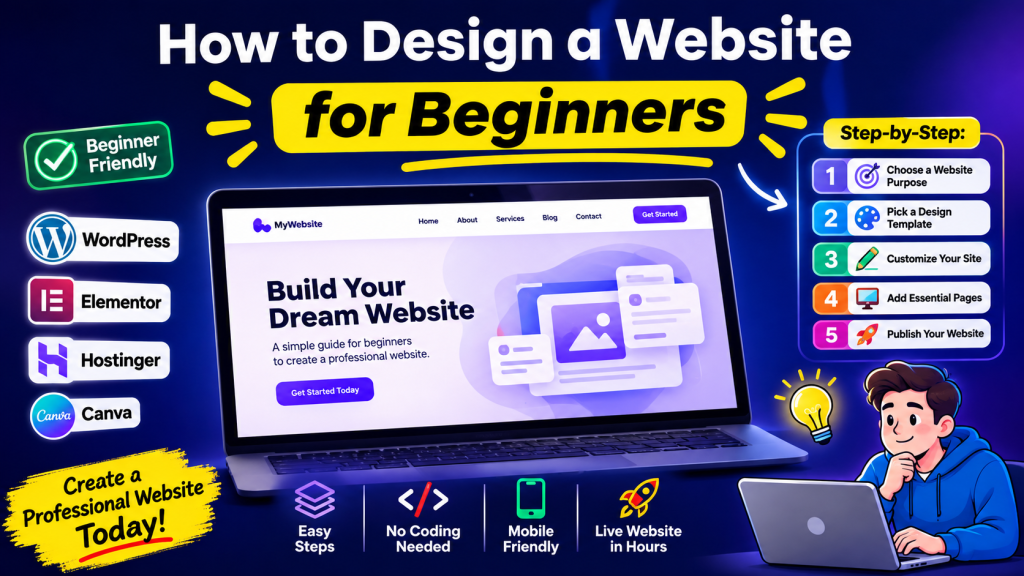
Designing a website can feel intimidating when you’re starting from scratch. Many beginners assume they need to learn programming, graphic design, or complex web development tools before they can build a professional-looking site. The good news is that modern website builders and content management systems make website design for beginners much more accessible than it used to be.
A well-designed website helps visitors understand what you offer, find information quickly, and take action—whether that means contacting you, making a purchase, or reading your content. Good design is not only about making a site look attractive; it is also about creating a clear, easy-to-use experience.
In this guide, you’ll learn how to design a website for beginners step by step. We’ll cover planning your website, choosing a layout, selecting colors and fonts, improving navigation, designing for mobile devices, adding basic SEO elements, avoiding common mistakes, and testing your site before launch. You do not need advanced coding knowledge to get started.
What Do You Need Before Designing a Website?
Before you choose colors or arrange page sections, take a few minutes to prepare. Planning first will help you make better design decisions later and prevent unnecessary redesign work.
Define your website purpose
Start by asking: What is this website supposed to accomplish?
Common website goals include:
- Promoting a business or service
- Selling products online
- Building a personal portfolio
- Publishing a blog
- Sharing educational content
- Generating leads or inquiries
Your design should support that goal. A photography portfolio, an online store, and a local business website all require different layouts and features.
Identify your target audience
Think about the people who will visit your website.
Ask yourself:
- Who are they?
- What problem are they trying to solve?
- What information do they need first?
- What action do I want them to take?
Designing for your audience makes the website more effective than designing based only on personal preferences.
Choose a domain name
A domain name is your website’s address on the internet, such as example.com.
A good domain name is:
- Short and easy to remember
- Easy to spell
- Relevant to your brand or topic
- Free from unnecessary numbers or hyphens
Select a hosting provider
Web hosting stores your website files and makes them available online. Many hosting companies offer beginner-friendly plans with one-click website installation and built-in security features.
If you use a website builder such as Wix, Squarespace, or Shopify, hosting is usually included.
Choose a website platform (CMS)
For beginners, the easiest options are:
- WordPress (flexible and widely used)
- Wix (drag-and-drop simplicity)
- Squarespace (excellent design templates)
- Shopify (best for eCommerce)
Choose a platform that matches your website goals and technical comfort level.
Prepare basic content and branding
Before designing pages, gather:
- Your logo (if available)
- Brand colors
- Fonts you want to use
- Business description
- Photos or product images
- Contact information
- Social media links
Having this content ready will make the design process much smoother.
Plan Your Website Structure
One of the most important website design basics is planning your website structure before building pages.
Decide what pages you need
Most beginner websites only need a small number of pages.
A simple website usually includes:
- Home – overview of your website
- About – information about you or your business
- Services or Products – what you offer
- Blog (optional) – articles or updates
- Contact – how visitors can reach you
Avoid creating too many pages at the beginning. You can always expand later.
Create a simple sitemap
A sitemap is a basic map of your website pages and how they connect.
Example:
Simple sitemap
Home
About
Services
Blog
Contact
This simple structure is easy for both visitors and search engines to understand.
Why planning saves time
Many beginners start designing immediately and later realize they forgot important pages, navigation items, or content sections.
Planning first helps you:
- Organize information logically
- Create consistent navigation
- Reduce redesign work
- Improve user experience
- Make future expansion easier
Choose the Right Website Design and Layout
A website layout determines how content is arranged on each page. Good layouts guide visitors through information in a logical order.
Header and navigation
The header appears at the top of the page and usually contains:
- Logo
- Navigation menu
- Contact button or CTA
- Search icon (optional)
Keep the menu simple and avoid overcrowding it with too many links.
Hero section
The hero section is the large area near the top of the homepage.
A beginner-friendly hero section includes:
- A clear headline
- A short supporting description
- One primary call-to-action button
- A relevant image or illustration
Example:
- Headline: “Professional Plumbing Services in Brisbane”
- Description: “Fast, reliable residential and commercial plumbing solutions.”
- Button: “Get a Free Quote”
Main content sections
Below the hero section, organize information into clear blocks.
Common homepage sections:
- Services overview
- Benefits or features
- Customer testimonials
- Portfolio or recent work
- FAQ
- Final call-to-action
Each section should have a clear heading and enough spacing between content blocks.
Calls-to-action (CTAs)
A CTA tells visitors what to do next.
Effective CTAs include:
- Contact Us
- Get Started
- Book a Consultation
- View Services
- Request a Quote
- Shop Now
Use one primary CTA consistently throughout the page.
Footer
The footer appears at the bottom of every page.
Include:
- Contact information
- Address (if relevant)
- Social media links
- Copyright notice
- Privacy Policy
- Terms (if needed)
A clean footer improves usability and professionalism.
Create a clean page structure
A simple page structure often works best:
- Header
- Hero section
- Main content sections
- Testimonials or supporting content
- CTA section
- Footer
Avoid placing unrelated elements randomly throughout the page.
Choose Colors, Fonts, and Visual Style
Visual consistency is one of the easiest ways to make a beginner website look professional.
Choose a simple color palette
Use a limited color palette.
A practical approach:
- Primary color – main brand color
- Secondary color – supporting color
- Neutral color – white, gray, or black
For example:
- Blue
- Dark gray
- White
Too many colors make a website look unorganized.
Use readable fonts
Prioritize readability over decoration.
Good beginner font choices include:
- Inter
- Roboto
- Open Sans
- Lato
- Arial
Use:
- One font for headings
- One font for body text
Avoid using multiple decorative fonts.
Maintain visual consistency
Keep the following consistent across pages:
- Button style
- Heading sizes
- Colors
- Spacing
- Icon style
- Image treatment
Consistency helps users recognize patterns and navigate more comfortably.
Use images appropriately
Choose images that support your content.
Best practices:
- Use high-quality photos
- Compress images for faster loading
- Avoid blurry or stretched images
- Keep image styles consistent
Stock photos can work, but authentic business photos often create more trust.
Avoid visual clutter
Common beginner mistakes include:
- Too many colors
- Too many fonts
- Excessive animations
- Background videos everywhere
- Busy patterns behind text
White space is not empty space—it improves readability and focus.
Make Your Website Easy to Navigate
Navigation is one of the most important parts of beginner website design.
Keep navigation simple
Most websites do not need large complicated menus.
A simple menu might include:
- Home
- About
- Services
- Blog
- Contact
If visitors cannot quickly understand your menu, simplify it.
Use descriptive menu labels
Avoid vague labels such as:
- Stuff
- Info
- More
Instead use:
- Services
- Pricing
- Portfolio
- Resources
- Contact
Clear labels help users find information immediately.
Make important pages easy to find
Your most valuable pages should be accessible within one or two clicks.
For example:
- Contact page
- Pricing page
- Services page
- Product categories
Do not hide critical information inside multiple nested menus.
Add clear CTAs
Place important CTAs in visible locations:
- Header
- Hero section
- Middle of long pages
- Footer
Use action-oriented text such as “Get a Quote” rather than “Click Here.”
Focus on user experience
Ask yourself:
- Can a first-time visitor understand the website quickly?
- Is important information easy to find?
- Can users complete their goal without confusion?
A beautiful website with poor usability will still perform poorly.
Design for Mobile Devices
A large percentage of website visitors use smartphones. Mobile-friendly design is essential.
What is responsive web design?
Responsive design automatically adjusts your website layout for different screen sizes.
A responsive website works on:
- Mobile phones
- Tablets
- Laptops
- Desktop computers
Most modern website builders and WordPress themes support responsive design.
Make text readable
For mobile devices:
- Use sufficiently large font sizes
- Increase line spacing
- Keep paragraphs short
- Avoid very wide text blocks
Readers should not need to zoom in.
Ensure buttons are easy to tap
Mobile buttons should:
- Be large enough for fingers
- Have space between buttons
- Use clear labels
Small crowded buttons create frustration.
Optimize images and page elements
Large images can slow down mobile performance.
Compress images before uploading.
Also check:
- Sliders
- Videos
- Popups
- Forms
- Tables
Ensure they display properly on small screens.
Test different screen sizes
Preview your website on:
- iPhone
- Android phone
- Tablet
- Laptop
- Desktop monitor
Many website builders include built-in responsive previews.
Add SEO-Friendly Website Design Elements
Good design supports search engine optimization. Even beginners can implement basic SEO elements.
Use proper heading structure
Organize pages with headings:
- H1 – page title
- H2 – main sections
- H3 – subsections
This improves readability and helps search engines understand page content.
Create SEO-friendly URLs
Keep URLs short and descriptive.
Good:
/web-design-services//contact//about-us/
Avoid:
/page?id=123/newpagefinal2
Write descriptive page titles and meta descriptions
Each page should have:
- A unique page title
- A clear meta description
These appear in search engine results and influence click-through rates.
Add image alt text
Alt text describes images for:
- Search engines
- Screen readers
- Accessibility
Example:
- “Blue ceramic coffee mug on wooden desk”
Avoid generic alt text such as “image1.”
Use internal links
Link related pages together.
Example:
- Home → Services
- Services → Contact
- Blog article → Related blog article
Internal linking helps users and search engines navigate your website.
Improve page loading speed
Faster websites generally provide a better user experience.
Basic speed improvements:
- Compress images
- Use optimized themes
- Remove unnecessary plugins
- Enable caching (if available)
- Limit heavy animations
Ensure mobile friendliness
Search engines prioritize mobile-friendly websites.
Responsive design is one of the most important SEO-related design decisions beginners can make.
Common Website Design Mistakes Beginners Should Avoid
Learning how to design a website also means knowing what to avoid.
Overcomplicated layouts
Trying to include every feature on one page usually creates confusion.
Keep layouts simple and focused.
Poor navigation
Hidden menus, confusing labels, and inconsistent navigation frustrate visitors.
Too many colors and fonts
Limit colors and typography to maintain a professional appearance.
Slow-loading images
Large unoptimized images are one of the most common beginner performance problems.
Weak calls-to-action
Do not assume visitors know what to do next.
Tell them clearly.
Ignoring mobile users
A desktop-only website can lose a significant portion of visitors.
Too much content above the fold
The top of the page should communicate the main message quickly.
Do not overload it with multiple banners, sliders, and long paragraphs.
Poor readability
Avoid:
- Tiny text
- Low color contrast
- Long dense paragraphs
- Inconsistent spacing
Lack of consistency
Different button styles, heading sizes, colors, and layouts make a website feel unfinished.
How to Test Your Website Before Launching
Before publishing your website, perform a simple quality check.
Check mobile and desktop versions
Verify that:
- Layouts adjust correctly
- Images display properly
- Text remains readable
- Menus work correctly
Test navigation and buttons
Click every:
- Menu item
- Button
- CTA
- Footer link
- Logo
Ensure they lead to the correct destination.
Check forms and links
Test:
- Contact forms
- Newsletter forms
- Booking forms
- External links
- Social media links
Broken forms are a common launch mistake.
Review spelling and content
Read every page carefully.
Check:
- Grammar
- Spelling
- Phone numbers
- Email addresses
- Prices (if applicable)
- Dates
Test loading speed
Open your website on:
- Wi-Fi
- Mobile data
- Different devices
Slow pages should be optimized before launch.
Check basic SEO elements
Confirm:
- One H1 per page
- Page titles
- Meta descriptions
- Image alt text
- Internal links
- Mobile responsiveness
Ask another person to test it
A fresh user often notices issues you no longer see.
Ask someone unfamiliar with the website to:
- Find a service
- Contact you
- Read a blog post
- Navigate between pages
Observe where they become confused.
Frequently Asked Questions
Can a beginner design a website without coding?
Yes. Modern website builders and content management systems allow beginners to create professional websites using templates and drag-and-drop tools without writing code.
What is the easiest way to design a website?
For most beginners, using a website builder such as Wix or Squarespace is the easiest option. WordPress is also beginner-friendly and offers more flexibility for long-term growth.
How much does it cost to design a website?
The cost varies depending on your platform, hosting, domain name, premium themes, plugins, and whether you hire a designer. A basic beginner website can often be created with relatively low monthly costs, though pricing should be verified with your chosen provider before publication.
What pages should a beginner website have?
A simple beginner website should include a Home page, About page, Services or Products page, Contact page, and optionally a Blog page.
How long does it take to design a website?
A basic website can often be designed in a few hours or days. A more polished website with custom branding, content, and optimization may take several weeks.
What makes a website user-friendly?
A user-friendly website has clear navigation, readable text, fast loading speed, mobile responsiveness, consistent design, and obvious calls-to-action.
How do I make my website mobile-friendly?
Use a responsive website theme or builder, keep text readable, make buttons easy to tap, optimize images, and test your site on multiple screen sizes before launching.
Final Thoughts
Learning how to design a website for beginners is much easier than many people expect. You do not need advanced technical skills to create a website that looks professional and serves your audience effectively.
Start by defining your website’s purpose and planning a simple structure. Choose a clean layout, readable fonts, consistent colors, and straightforward navigation. Design with mobile users in mind, include basic SEO elements, and test everything carefully before launch.
The most important principle is simplicity. A website that is easy to understand, easy to navigate, and easy to use will usually outperform a complicated website filled with unnecessary features. Begin with a small, well-organized website, publish it, and improve it over time as you gain experience and learn what your visitors need.